Geospatial Social Studies
- Tom Hammond
- Former user (Deleted)
This page lists, links to, and briefly describes files developed for the purposes of teaching social studies using geospatial tools (primarily Google Earth and My World GIS). Most, but not all, of these files have been developed at Lehigh University by students in the Teaching and Learning with Geospatial Tools (TLT 368) course taught by Dr. Hammond.
If you find these materials interesting, we recommend that you also visit similar efforts–no guarantees that these links still work, tho...
- Jamie Gustin's Google Earth users guide for social studies teachers.
- Rick Thomas' In Time and Place website and GIS for History eBook.
- Carol Larow's Google Historical Voyages and Events
- Joshua Radinsky's GIS for History project at the University of Illinois - Chicago
- Jung Eun Hong's GIS for Social Studies at the University of Colorado at Boulder
- The Virginia Geographic Alliance's GIS Lessons for K-12.
- Bill Ferster's VisualEyes project at the University of Virginia.
- The Teaching American History Project at Portland State – they have an extensive dataset on Northwestern topics, but also strong materials for broadly-applicable topics.
- ThinkQuest's Teaching History with GIS site. Appears to have been inactive for a long time, but has invaluable .shp files available for download.
- Herb Thomson's A Geographic View of World History (available through either NCGE or Carte Diem Press): 32 lesson plans for World History, World Geography, and/or AP courses.
- Not a curricular resource, but: Check out Esri's map of GIS in US K12 contexts. Lots of tabs in there! Do explore.
Our files are currently organized chronologically by topic.
circa 4000 BCE - 0: Cradles of Civilization (as per AP World History)
Google Earth file developed by Tom Hammond, 2012: APworld_cradles_of_civ_ver03.kmz.
Description: Provides placemarks (with perspective) for settlements from six 'origin' civilizations specified in the AP World History curriculum.
Source file (heavily adapted): heritage-key.com/files/PradPatel/googleearth/great-cities.kml
Still in development: Add dates / contextual detail; re-consider representation of Andean highland civilization (currently singles out Chavin; should probably include Caral-Supe/Norte Chico)
circa 200 BCE - approx. 1500: Silk Route(s)
Google Earth file developed by Tom Hammond, 2012: Silk_Roads_ver03.kmz.
Description: Placemarks of stops along the Silk Roads; no contextual detail.
Sources used (just folded together, no editing)
circa 200 BCE - approx 1500: Great Wall(s) of China
Google Earth file developed by Yuanyuan Zhang, 2010; revised by Tom Hammond, 2012: Great Wall(s) of China ver04.kmz.
Description: Depicts the multiple time periods and places of the development of the wall; it is not a single, monolithic concept but took different forms in different time periods. Perspective applied to selected points along the wall to illustrate topography; includes Badaling tourist stop.
Sources consulted:
circa 1270-1520: European Explorers
Google Earth file first composed by Tom Hammond, 2008: European explorers ver02.kmz.
Description: Presents overview of European 'voyages of discovery', framing them in a search for water routes to Asia. Uses Jamestown and the instructions to the settlers to invite a driving question. (For example: Why are these instructions so specific? Why specify taking the northwest branch of a river? And what is meant by 'the other sea'?) It then moves back to discuss European contact with east Asia, using Marco Polo (but the Crusades would also be a logical point of reference). Traces efforts by Genoa, Portugal, and then Spain to locate water routes to Asia as a way of addressing the driving question (i.e., the Portuguese had found a water route south and east; the Spanish had found a route west and south; the English and others hoped to find a route west and north).
This file is pretty approximate work and contains much room for improvement! Does not include other voyages commonly included in the K-12 curriculum: Spanish intra-continental expeditions (e.g. Cortez, Pizarro, Balboa, de Leon, et al.), French explorers (Champlain, Marquette, et al.), other English expeditions (Cabot, Hudson, et al.). Other authors are invited to add these, or teachers could have their students add these as extensions to the existing file.
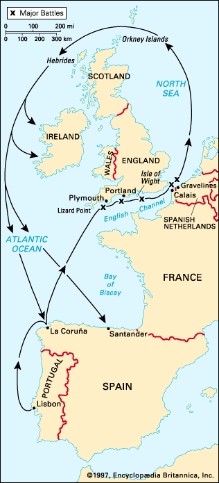
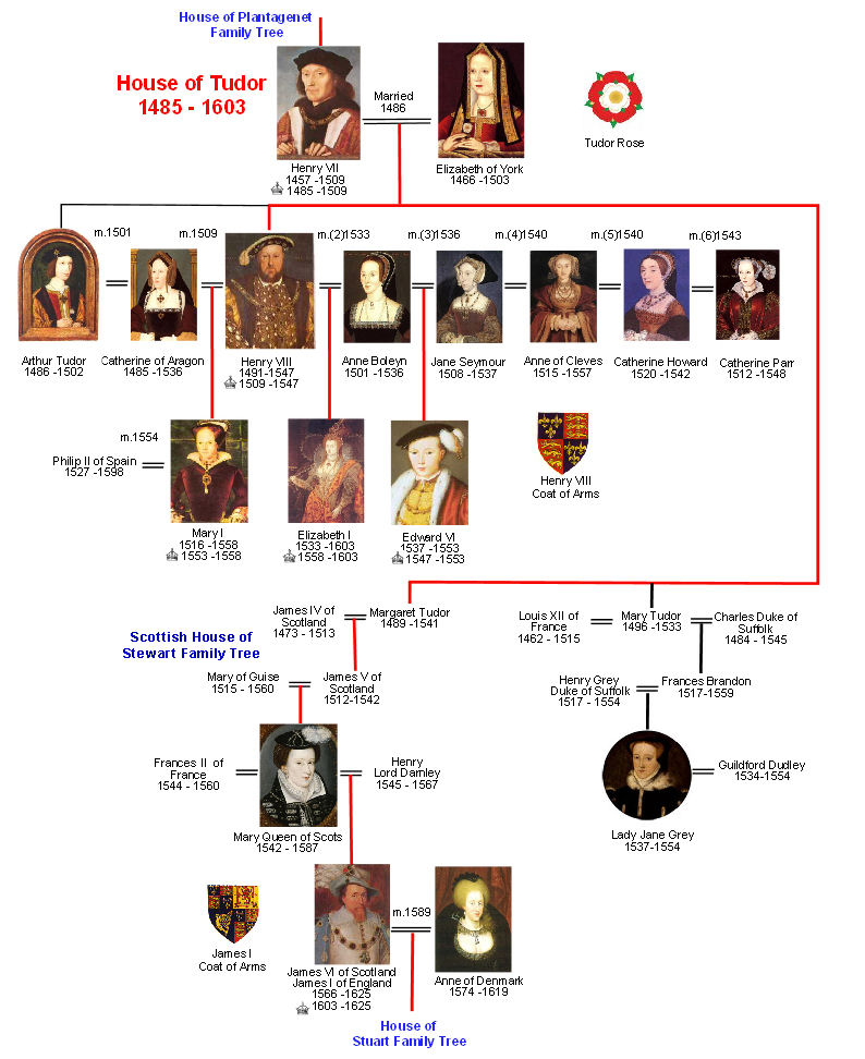
1588: Spanish Armada
SmartNotebook file developed by Tom Hammond, 2012: spanish_armada_notebook_ver02.notebook.
Description: Map of western Europe, plus images and diagrams to support explaining the relationships among the political leaders (i.e., marriages of Henry VIII, wedding portrait of Mary Tudor and Phillip II, etc.). Developed to for an 8th grade American History class using Prentice Hall's America, History of Our Nation. Accompanied by guided note sheet, created in ppt.
Sources consulted: Primary map is adapted from EmersonKent.com; Tudor family tree adapted from britroyals.com. Other images from Wikipedia and Britannica.
circa 1600: European Religions
Google Earth file developed by Richard Rosenblum & Tom Hammond, 2012: Religious map of Europe - 1600 ver02.
Description: Presents major religious denominations of Europe, circa 1600: Roman Catholic, Orthodox, etc.
Source consulted: European Religions, 1600 by Holt, Rinehart, Winston.
1585-1620: Early British settlements in North America
Jamestown: ArcGIS Online map created by Tom Hammond in 2023, drawing upon materials from the Virtual Jamestown Project: indian_groups.kmz, along with various sources for overlays of historical maps.
More comprehensive view: Google Earth created by Tom Hammond, 2012: British_colonies_in_North_America_ver02.kmz.
SmartNotebook file to accompany Google Earth overlay (contains static versions of historical maps, plus other information): early_colonies_notebook_ver01.notebook.
Description:
- Expands upon VCDH's concept of Jamestown viewed from "inside the longhouse" -- rather than view the English settlement in a vacuum, this overlay shows the inverse: the Native American settlements in the region. For the English, it was a New World; for the Chesapeake-area residents, it was a familiar territory. For more information about the file, see www.virtualjamestown.org/ge_indian_groups.html
- Accompanying documents and data, including the 1595 map by John White, 1608 map by John Smith, and locations for the archaeological Jamestown and a reconstructed Fort Raleigh at Roanoke, plus several New England colonies (Plymouth, but also predecessors at Cuttyhunk and Popham).
For more information about the Virtual Jamestown project, including other geospatial displays of the area, see www.virtualjamestown.org/page2.html
1739 - 1818: European Settlement patterns in the Lehigh Valley
ArcGIS.com StoryMap created by Tom Hammond, 2018: https://arcg.is/0LiKD1
- NOTE: Not all of the data layers are publicly viewable. I'm using other people's work in parts of the map, and some of their layers are only visible to Lehigh University users. I haven't yet figured out how to get around this.
Maps selected settlements along the Lehigh River (from east to west: Easton, Bethlehem, Allentown, Mauch Chunk/Jim Thorpe) and guides students to observe two patterns: (1) settlement the settlements spread upstream, and (2) settlements were established at the confluence of two or more waterways. The patterns are then extended (does Philadelphia fit the same profile?) and challenged (does the same pattern hold in other watersheds? For other times/cultures?)
1754 - 1763: French and Indian War
My World GIS file developed by Jeff Snyder and Yuanyuan Zhang, 2010-2011:French_and_Indian_War_ver02.m3vz
Description: Uses an adapted form of the 1790 census to show the British settlers' desire to cross the Appalachian Mountains. Political markups include disputed territories, battle sites, etc.
Still in development: Merging data from the 1790 census and the research on border counties in 1750.
circa 1764: Trans-Atlantic Triangle Trade
SmartNotebook file developed by Tom Hammond, 2010-2014: SB_triangular_trade_overlays_ver02.notebook
Description: Uses a vendor-provided basemap to present discussion of Triangle Trade: teacher (or students) can drag on and manipulate images of slaves (slave ship Brooks), cotton, sugar, molasses, and rum. Also includes portraits of John and Moses Brown and the Brown University logo. Second page of file has info on Brown family for discussion of role of slavery (or profits from slave trade) in building this institution.
July 4, 1776: Signers of the Declaration of Independence
ArcGIS Online map by Julie Oltman & Tom Hammond; StoryMap by Tom Hammond
Description: Uses colony boundaries from 1763, population data from 1770, and data about the signers of the Declaration from archives.gov (https://www.archives.gov/founding-docs/signers-factsheet); slave ownership data from https://www.mrheintz.com/how-many-signers-of-the-declaration-of-independence-owned-slaves.html
(FYI: The Declaration was adopted by the Continental Congress on July 4, 1776; the signing was actually on a different date. For our purposes, this is not important.)
1787-1790: Constitutional Convention v. First Census
Google Earth file of relevant places in Philadelphia developed by Jeff Snyder, 2010: Constitutional_Convention_places_ver02.kmz
Description: Provides viewers with a sense of the space occupied by delegates at the Constitutional Convention (primarily the historic district). Includes an image overlay of a period map of Philadelphia plus placemarkers for Independence Hall, local boarding houses and gathering places, etc.
ArcGIS Online map (Tom Hammond, 2020) with layers for population estimates used at Convention (see source, below), plus 1790 census, plus ratio layer to compare overestimates (CT) vs. underestimates (everywhere else, but particularly the south): https://arcg.is/n5XCL
To be further explored: Unpacking the political dynamics of the 3/5ths Compromise--how to balance the voting power of southern and northern states?
Source: Population estimate data drawn from notes by David Brearley, presented in Potter, L. (2006). Population estimates used by Congress during the Constitutional Convention. Social Education, 70, 270-2. Brearley's numbers are transcribed into a publicly-available Google Spreadsheet
1787 - 1958: Addition of U.S. State Governments
Google Earth file with timeline feature of states in the United State, developed by Brian Flood: us_states.kml
Description: Provides viewers with the sequence of states being added to the United States, starting with Pennsylvania, New Jersey, and Delaware (1787) and concluding with Hawaii (1958). Note that this file uses the timeline feature, allowing the user to scroll backwards and forwards through the process of adding states. In fact, by looking at the kml in a text editor, I was able to figure out some of the basics of working with the timeline.
1790 - 1870: Antebellum African-American population / Enslaved populations under the Constitution
My World GIS file developed by Doug Scott, 2010: Af-Am_pop_1790-1870_ver02.m3vz; version for Arc by Tom Hammond, 2012 – see filelist.
ArcGIS Online version – covering only 1790, 1820, 1840, and 1860 – by Tom Hammond, 2020: https://arcg.is/190HHi
Description: Allows users to inspect population data to view the gradual extinction of slavery in the north and the intensification of slavery in the south--in 1790, the southern states' populations had at most 40% (approx.) enslaved persons; by 1860, this figure had risen to almost 60%. See teaching notes for suggestions.
Still in development: Adjusting the organization of population data and map displays. For example: Maine is presented as a separate state; it was actually part of Massachusetts until 1820
1791 - 1794: Whiskey Rebellion
ArcGIS.com map created by Tom Hammond, 2018. Note that this is a replica of a project by Jeff Snyder (2010), created as a My World GIS file: Whiskey_Rebellion_ver01.m3vz
Description: Shows the western Pennsylvania counties in rebellion and uses the 1790 census data to explain the distance from the primary markets and the economic significance of distilling grain into alcohol. Features placemarks for events of the rebellion, including Washington's march towards western Pennsylvania.
Sources: ArcGIS.com version draws upon maps and census data assembled by BucknellGIS.
1804 - 1806: Expedition of Lewis & Clark
Google Earth file developed by Natalie Green, 2008: Lewis_and_Clark.kmz
Description: Provides a path from the expedition's starting point to its terminus on the Pacific Coast. Includes images from places and encounters along the way, and makes use of the Rumsey historical map collection to include the engraved map produced from the expedition's sketches.
1804 - 2005: The Louisiana Purchase & Native American Displacement
Extensive Google Earth file – incorporating GIS data and historical map overlays – developed by the Teaching American History project at Portland State, 2008: LA_Purchase_Native_GoogleEarth.kmz
Description: An absolute cabinet of wonders, containing multiple datasets on the topic. Includes colonial era maps, the complete path of Lewis & Clark's travels, census data on population in 1800 and 1830, paths and polygons showing Indian removal and reservation policies, and much more.
1820-1860: Major Products of North and South in 1820 to 1860
Activity developed by Jung Eun Hong, University of Colorado: Activity 1
- Uses ArcGIS Explorer; runs in a browser
- Requires MS Silverlight, not compatible with all browsers
- Requires (free) ESRI account
Description: Draws upon textbook information to "compare nine major products and industries of the U.S. between 1820 and 1860--Cattle, Cotton, Grain, Iron/Steel, Lumber, Mining, Rice/Sugar cane, Textiles, and Tobacco."
1820s - 1920s: Morris Canal
Google Earth file developed by Doug Scott, 2009: Navigating_History_Along_the_Morris_Canal.kmz
Description: Shows the segments and locks along the Morris Canal as it crossed northern New Jersey between the Delaware River (opposite the Lehigh Canal) and the Port of New Jersey (opposite New York City).
1837 - 1845: Slavery in the Republic of Texas
VisEyes dataset by Andrew Torget: Texas Slavery Project.
Description: Two duplicate .
1861 - 1865: American Civil War, Eastern Theater Battles
ArcGIS.com map created with help from Tom Baker of Esri
Description: Two duplicate layers set to different fields: color-coded by campaign and color-coded by year. Color-coding by year allows the viewer to see and infer the broad outlines of the war strategy in this theater.
Source: Worked from the wonderful Google Earth file Civil_War_by_Campaign.kmz created by C Woodcock.
1906: Allentown City Parks System
ArcGIS Online StoryMap created by Tom Hammond, Oct 2018. (The map the StoryMap is built from is also available.)
Description: Walks through observation and analysis of the Allentown city parks system – why are the parks located where they are? What causes this pattern?
(Note: The same pattern exists in Philadelphia (ArcGIS Online map)...probably the same in many, many cities.
1933: Child Laws in the United States
ArcGIS Online map created in 2023 by Tom Hammond
Description: Compiles data from a 1933 report by the US Dept of Labor's Children's Bureau regarding various state-level regulations on child labor. To work with the raw data, start with this spreadsheet.
1933 - 1945: The Holocaust
Google Earth timeline of Nazi camps, 1933-1945, from the US Holocaust Memorial & Museum: http://www.ushmm.org/maps/camps.kml
Description: Timeline of placemarks, starting with Dachau. For the selected camps, provides dates of opening / closing, types of prisoners held there, estimates of population and number killed, companies that used labor from the camp, etc.
My World GIS file created by Tom Hammond, 2011: Jewish populations circa Holocaust ver01a.m3vz
ArcGIS.com map created by Tom Hammond, 2016; additional border layers from Julie Oltman
Description: Uses data from Yad Vashem to show pre-war Jewish populations and number of victims of the Holocaust for selected countries. Allows students to grasp the full extent of the Holocaust (e.g., it includes countries such as Tunisia and Libya, which were then under Italian control), and to note discrepancies in patterns (e.g., percentage of Jews killed in Germany vs. Poland; the strong contrasts within the southeastern Europe such as between Bulgaria and Greece). Note: The map uses contemporary borders. Borders for 1938 and 1945 are included as a reference; users should keep in mind that the borders were in flux at this time.
Sources consulted:
...http://www1.yadvashem.org/IMAGE_TYPE/8381.jpg & ...8380.jpg
1939-1945: World War Two
Google Earth file developed by Tom Hammond, spring 2012: World_War_2_ver04.kml
Description: Still very much a work in progress. Overviews events in the European and Pacific theaters.
GIS fileset on World War Two casualties developed by Eric Budge, summer 2011–see fileset page.
Description: World-wide (country-by-country) and American (state-by-state) figures for casualties (civilian as well as military) during World War Two. Great for getting across the points that (a) this is truly a world-wide conflict, and (b) the scale of human destruction is staggering, especially once you consider some of the non-US contexts.
1945-1955: Post-WW II: NATO and the Warsaw Pact
MyWorld GIS file developed by Richard Rosenblum, fall 2012 NATO WP.m3z
Description: MyWorld GIS file with post WWII country borders, NATO and Warsaw Pact countries and entry dates, and associated important cities.
1950s USA: Interstate Highway System; Levittowns
Highway system: Google Earth file developed by Tom Hammond & Rich Rosenblum, 2013: Interstate Highway System ver02.kmz
Description: Displays cities in selected northeastern states (PA, NY, OH, NJ, MD, DE) to illustrate some of the reasoning behind the development of the interstate highway system. Cities are rank-ordered by population, demonstrating how the interstates link population centers together. Students can be prompted to notice the density of highways around state capitals, illustrating their political power relative to their size. The instructor can zoom in to show beltways and secondary highway systems. Includes selection from Matt Fox's world-borders.kml.
Levittowns: Google Earth file developed by Greg Freeman, 2013: Levittowns ver02.kmz.
Description: Locates and dates three Levittowns outside of the NYC and Philadelphia metro areas.
Development note: These files were developed for use with students in Pennsylvania; however, it can be adapted to other geographic contexts.
1962: Cuban Missile Crisis
ArcGIS Online map developed by Tom Hammond, 2019. Google Earth file developed by Yuanyuan Zhang, 2010: Soviet vs US warheads.kmz
Description: Displays the warheads (and other strategic sites) in Cuba as well as the NATO warheads stationed in Turkey, allowing students to grasp the quid pro quo worked out between Dobrynin and RFK.
Sources consulted:
...http://www.gwu.edu/~nsarchiv/nsa/cuba_mis_cri/dobbs/warheads.htm
Contemporary / non-chronological material
Refining macro-geographic understandings
Google Earth file developed by Tom Hammond, spring 2012: Continents_and_components_draft01.kmz.
Description: An incomplete effort to section the continents into meaningful components, loosely following the framework used by many middle school textbooks (e.g., sub-dividing Asia into "Near East", South, East, etc.)
Rationale: Students' first exposure to world geography is commonly presented via continents/oceans and political geography. Both frames are self-limiting: The continents' divisions are not only geographic but also political (e.g., Europe vs. Asia) and obscure important comparisons (e.g., Egypt and Jordan are geographically similar but in different continents; Asia contains many different components with high levels of geographic, cultural, and political diversity). An emphasis on political geography creates a sense of determinism that is quite separate from the economic and cultural realities (e.g., post-colonial Africa, the Himalayan regions of Asia). This overlay cuts each continent into components that reflect their geographic / cultural characteristics. For example, Africa is divided into North (Mediterranean-adjacent), Saharan, West, East, Central, and Southern Africa. This is a VERY incomplete and tentative project; feel free to adapt / critique / suggest.
Political geography
Google Earth file created by Matt Fox (building upon others' work): world-borders.kml.
Description: Overlay that colors each nation (following the national borders, with some errors), making Google Earth's satellite data more closely resemble a traditional globe that displays political geography. Note that it has some mistakes / lack of current data (e.g., Ireland is unified; Sudan isn't split).
(end)