Upgrades to Course Site Spring 2024
Getting Started
The single most impactful feature of the upgraded course site is a completely redesigned and freshly intuitive look and feel. This overhaul brings many visual and interactive components already familiar to users of other major learning management systems and additional improvements that advance Moodle beyond other platforms. Interaction and navigation are consistent, efficient, and intuitive. This new user interface design is a significant jump forward, fully embracing modern web standards and best practices in navigation, accessibility, layout, and priority. To that end, we expect it may take a little time to get used to the new design features.
Once you dive into the core features and common course activities, you will find all your familiar settings and configuration options where you normally expect to find them and in a familiar organization.
Logging in and getting oriented
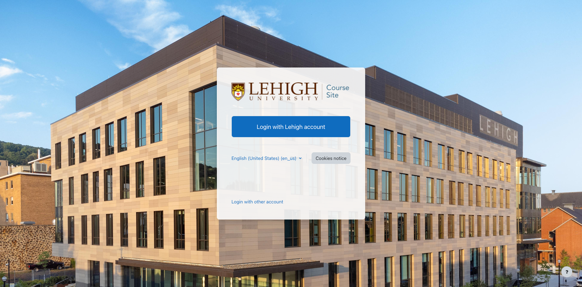
When you arrive, you will see the login page with the familiar login menu with the large "Login with Lehigh account" button. Click that button to login as you would any other single sign-on-enabled system at Lehigh.
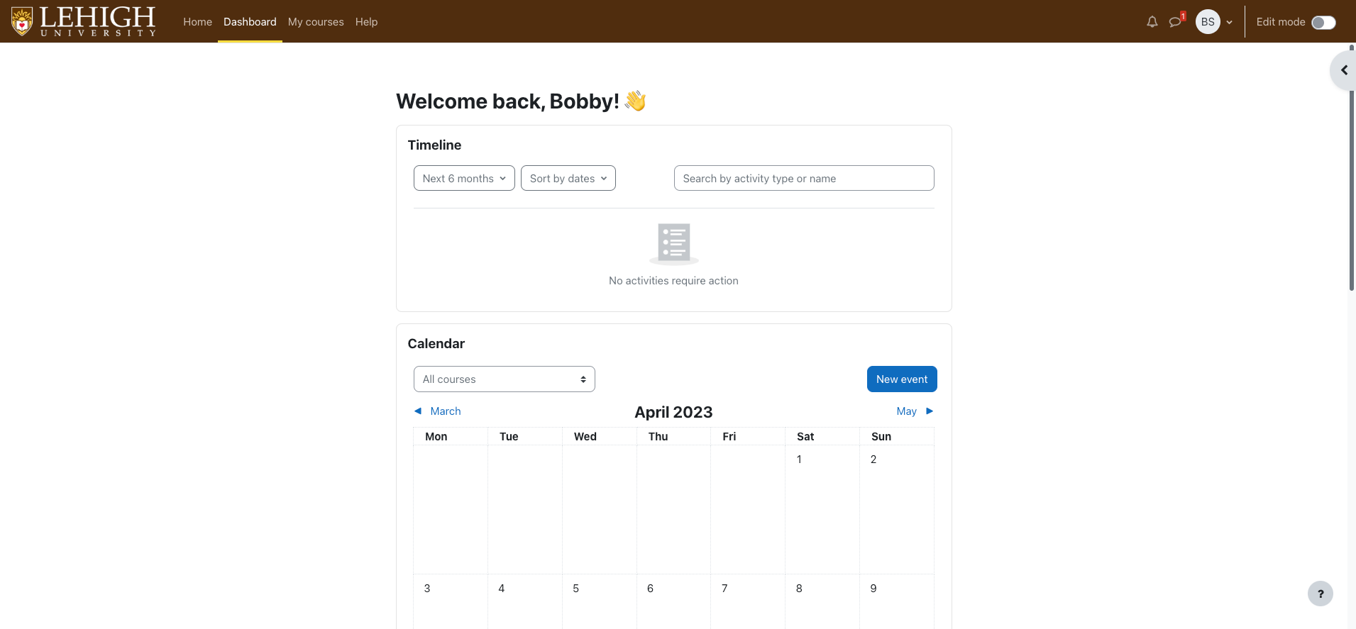
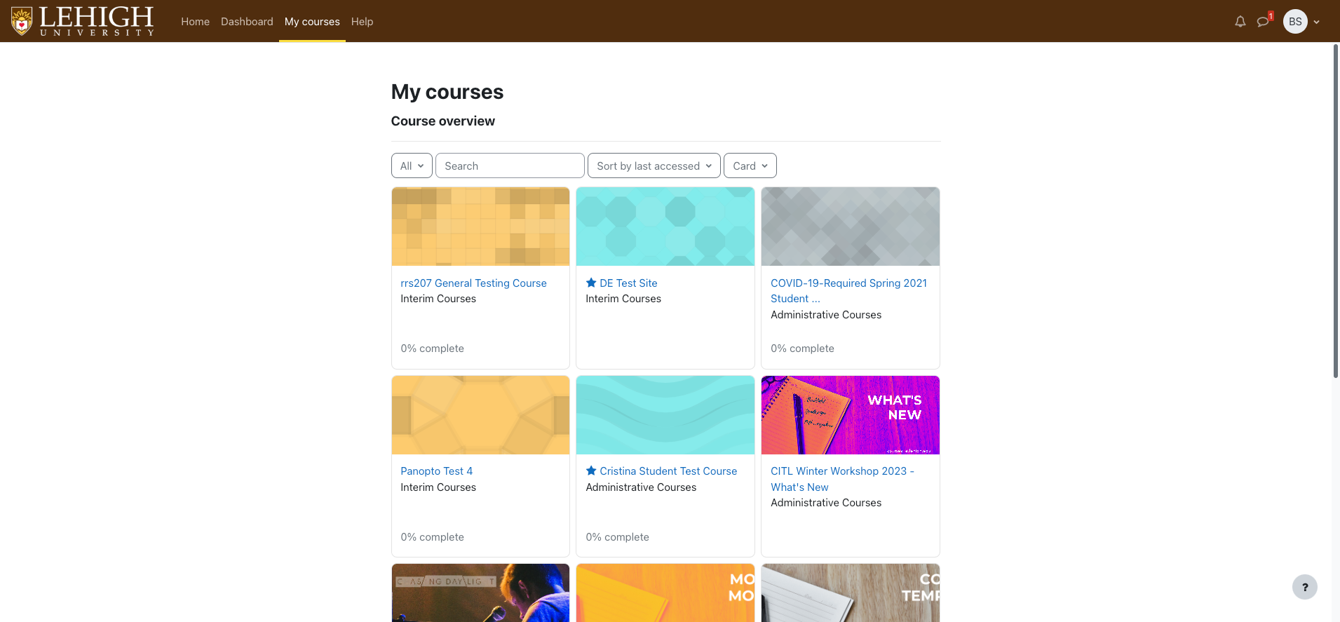
Upon successful login, you will first be taken to the user Dashboard. Previously, the dashboard, by default, included my courses in the main content region of the page and useful blocks including a timeline and calendar in the right sidebar. In Moodle 4, one of the modern, mobile-first, design elements implemented was the removal of traditional sidebars and the addition of slide-out drawers in both the left and/or right margins, where applicable. Moodle 4 splits the user dashboard and "My Courses" features into two separate components: a customizable Dashboard for course activities, calendar, and tasks; and, My Courses: a searchable, customizable display of all of your courses including past, current, and future courses.
User dashboard
By default, the user dashboard includes the timeline block and the calendar block and is customizable to the user's needs.
My courses
My courses now shows a comprehensive view of courses, similar to previous versions of Moodle, with an integrated search to find courses. Both the dashboard and courses page are completely personal to the user logged in.
User menu
Along the top-right of the screen (same as in current versions of Course Site), is the familiar user menu, indicated by an icon with your initials or the photo/avatar you have uploaded previously.
NOTE: Within the context of a course, and the customizable dashboard, a new Edit mode toggle will appear at the top-right to the right of the user menu. This toggle remains constant wherever available making edit mode easier to enable/disable. Additionally, when edit mode is activated, it will persist as you navigate through other areas of your course such as gradebook and activities.
New course layout
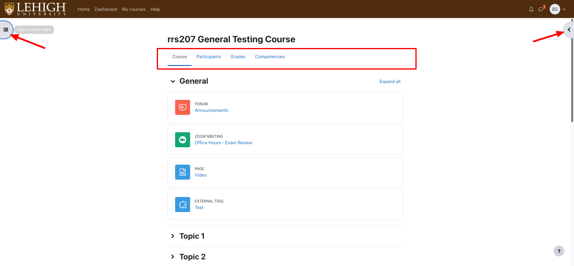
The new course layout is designed to put important course content and navigation front-and-center and make exceptional use of whitespace to decrease visual/cognitive load, including removing sidebar regions and replacing them with on-demand slide-out panels on the left and right edges of the screen. All the main course navigation that was previously found in the now-deprecated left "quick-nav" can now be found directly beneath the course title in the main content region. As always, this course navigation is role-sensitive so a course instructor will see different links than a student.
Take note of the gray tabs on the left and right edges of the screen. Clicking these tabs will reveal the slide-out panels on their respective sides.
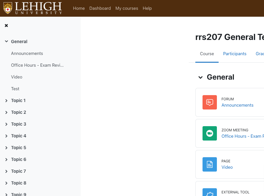
Left slide-out panel (course index)
The course index is an all-new feature in Moodle that allows for quick navigation to any section, activity, or resource of your course. Each section is collapsible just as the main course content so you can easily focus on just what you're accessing the course for. In certain course activity contexts, this left slide-out panel will become navigation for the corresponding activity. For example, in the book activity, this left slide-out panel becomes the book index or chapter navigation.
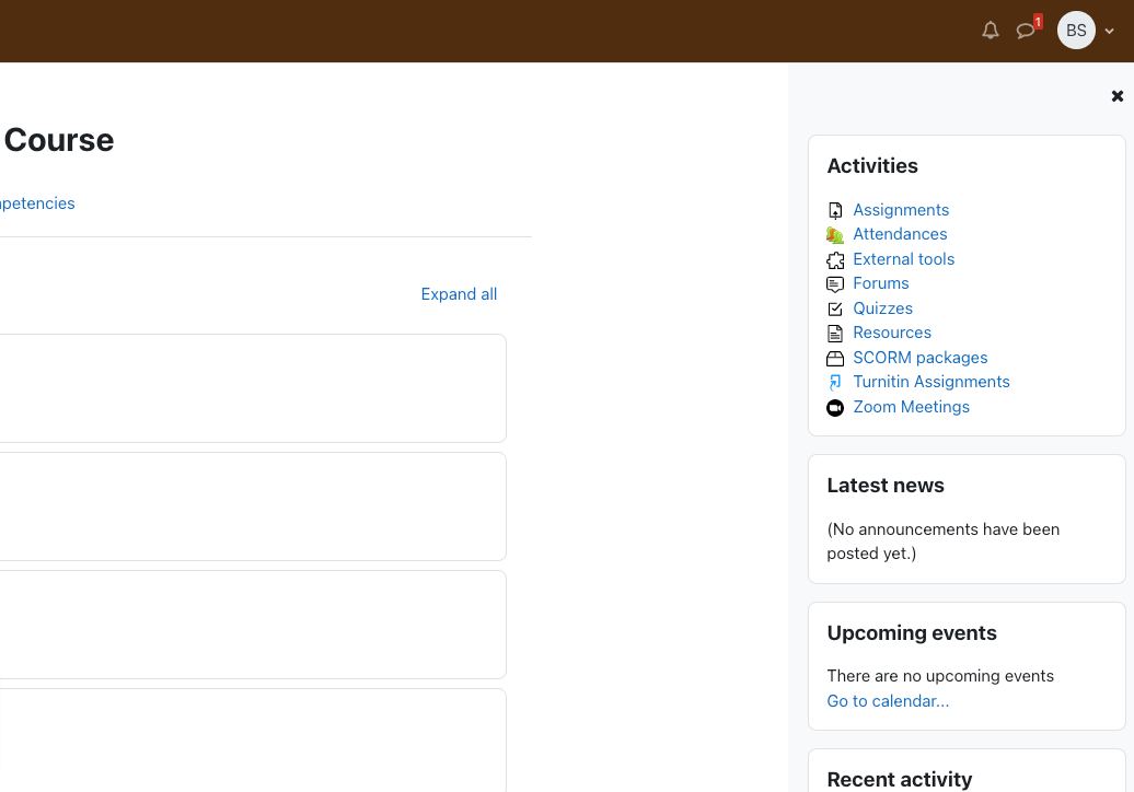
Right slide-out panel (blocks)
The right slide-out panel is the new home for blocks within a course. Again, this is also collapsed by default to reduce visual clutter on the course home page. All of the familiar course blocks are available here including Panopto, Upcoming events and others.
Questions?
if you have any questions, please reach out to us by emailing us at initt@lehigh.edu
